ScreenBuilder Redesign
(Best viewed on desktop)
Company
Roku
Role
UI/UX Design
Users
Merchandising
Timeline
Aug 2022 - Present

What is ScreenBuilder?
ScreenBuilder is the internal online editorial tool used to edit, curate, and publish content which is licensed and aggregated by Roku.
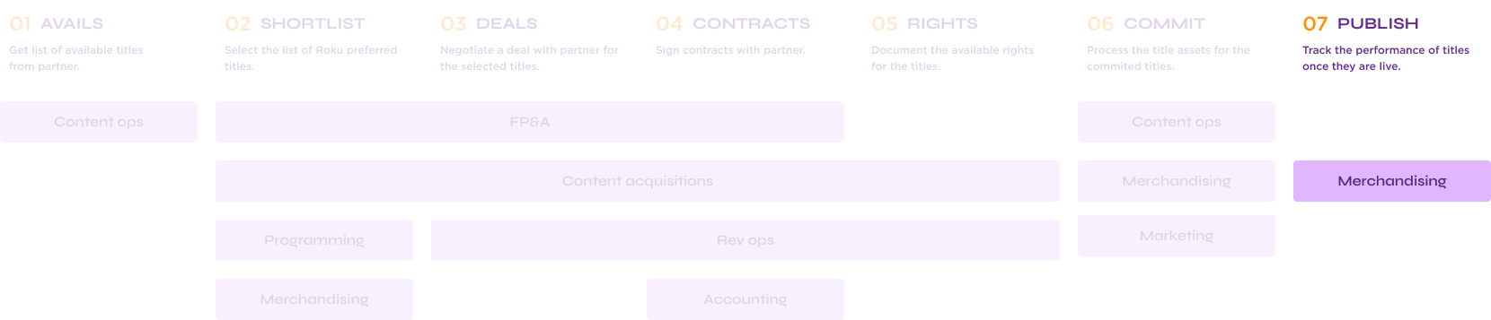
The Roku Channel pipeline
ScreenBuilder is the final stage in the pipeline and serves as a vital tool in Roku’s content strategy. It facilitates content curation and management across multiple platforms, as a result improving the user experience on Roku devices.
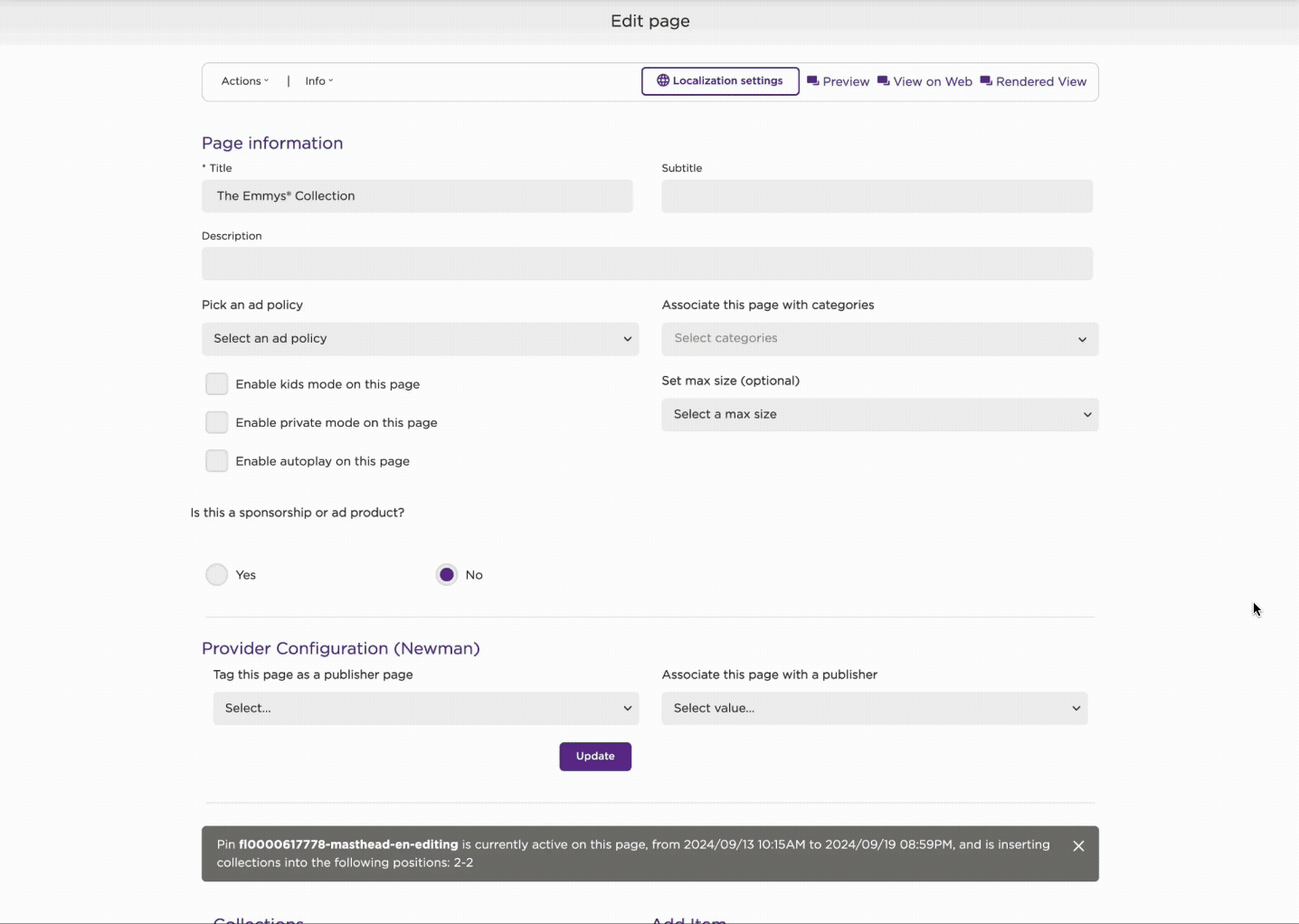
What internal team members see (old version)
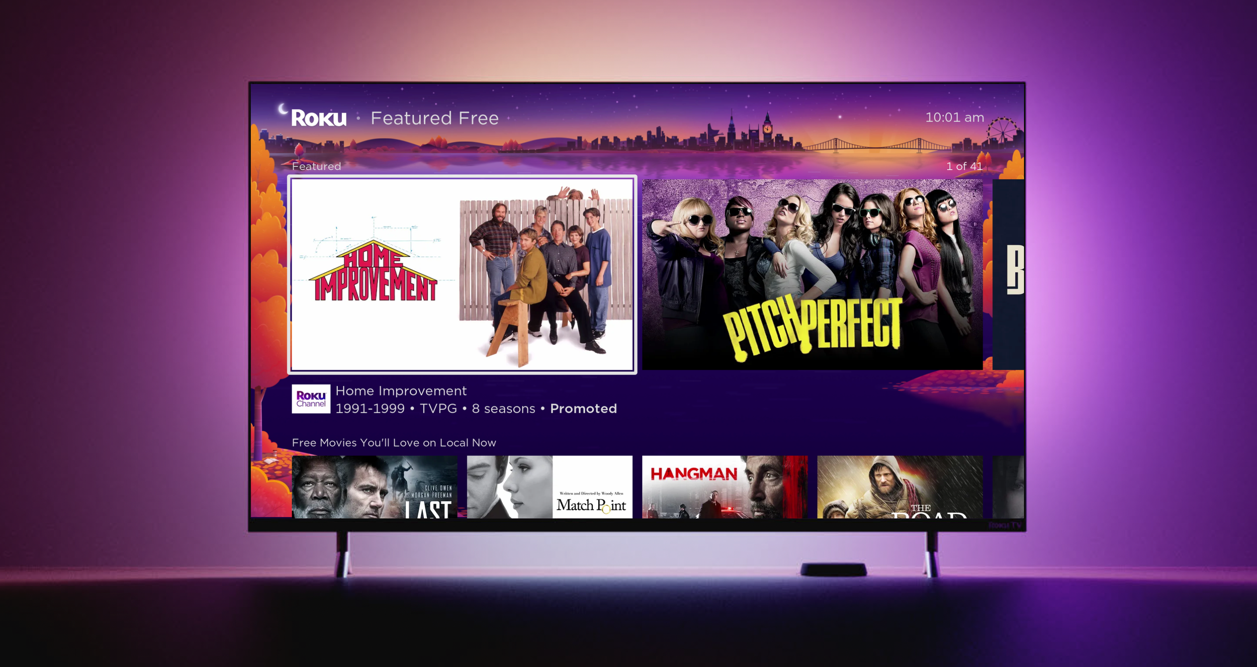
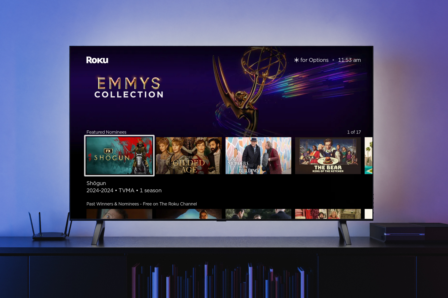
What Consumers see
🧐
Poor Search, Navigation, and Organization
The tool lacks an intuitive way to browse, filter, or organize large sets of assets/pages, forcing manual or error-prone workarounds.
Problem Space
As Roku expanded internationally, the merchandising team experienced growth and subsequently faced challenges related to onboarding new hires and providing comprehensive training on ScreenBuilder.
ScreenBuilder is a tool with powerful features & functions, with critical importance to the business - but its UX is convoluted, not designed around workflows and packed with work-arounds.
👇🏼 User feedback regarding challenges encountered while using ScreenBuilder 👇🏼
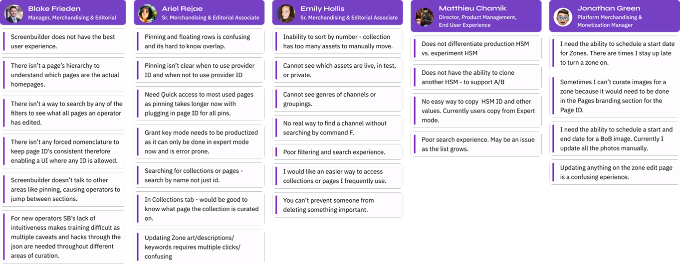
Themes of problem areas:
🚧
Inefficient & Error-Prone Workflows
Key workflows are tedious, repetitive, and prone to mistakes due to missing automation and guardrails.
😵💫
Usability & Learnability Issues
The tool has a steep learning curve, unclear UI feedback, and unintuitive interactions that frustrate both new and experienced users.
ScreenBuilder Redesign (so far)
ScreenBuilder Redesign (so far)
First things first!
Deprecate legacy components and collaborate with engineers to enhance ScreenBuilder by integrating Roku Design System (RDS), improving user experience and ensuring interface consistency (see below).
☝🏼 Old UI

Out with the old, in with the new [UI]
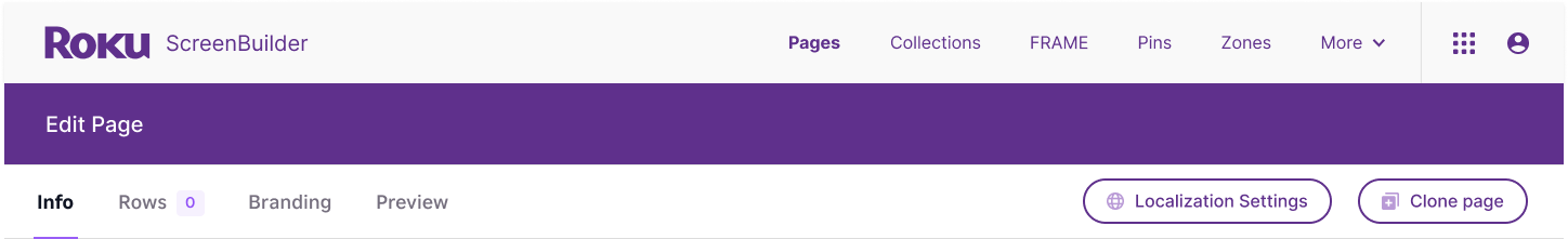
New vs. Old navigation
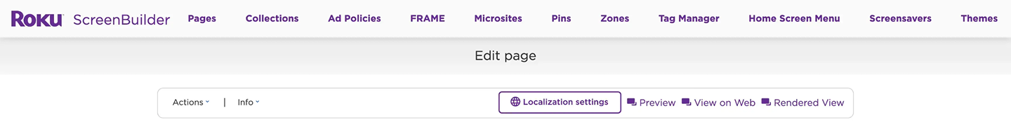
✅ Improvements:
Simplified navigation, reducing cognitive load and making it easier for users to find what they need without being overwhelmed.
Stronger visual structure, clearer hierarchy, and a modern, clean, and consistent design.
Tabbed content structure for easier navigation between sections
Increased discoverability of primary actions
New Layouts & Workflows
☝🏼 Old UI
✅ Improvements:
Layout and Structure
Old: Everything is stacked on a single long page
New: Content is broken into tabbed sections. Each step is separated into smaller, focused areas.
Improvement: Reduces cognitive overload by breaking tasks into manageable chunks.
Visual Design
Old: Dense UI, minimal spacing, flat lists, and limited visual hierarchy
New: Spacious layout, clear card-like sections, and modern form design. Empty state illustrations to bring some joy.
Improvement: More approachable, modern, and consistent.
Page Information
Old: Inputs are outdated, cramped, and sometimes ambiguous
New: Page information is more structured with labeled fields, required fields marked with * and contextual help icons.
Improvement: Better guidance and form clarity. Helps users understand what’s required vs optional.
Discoverability and Guidance
Old: No clear workflow — everything is visible at once, users did not know where to start
New: Guided flow via tabs. Inline tooltips provide guidance without clutter.
Improvement: Onboards users more naturally, guiding them through steps rather than overwhelming them upfront.
Enhance functionality by improving the primary sections responsible for creating and editing screens, thus streamlining the processes of editing, curating, and publishing content
Actions and Buttons
Old: Buttons are clustered at the bottom with unclear hierarchy
New: Actions are simplified
Improvement: More intuitive save to publish flow. Clear primary vs secondary actions.
Content Items
Old: Collection is embedded on the main page with long scroll lists, making it overwhelming when many items exist.
New: Moved to a dedicated “Rows” tab with clean controls.
Improvement: Cleaner workspace, easier to focus on structure first before loading content. Friendly empty state encourages next action.
Redesign the list user interface across all pages to enhance user control over content display and filtering options.
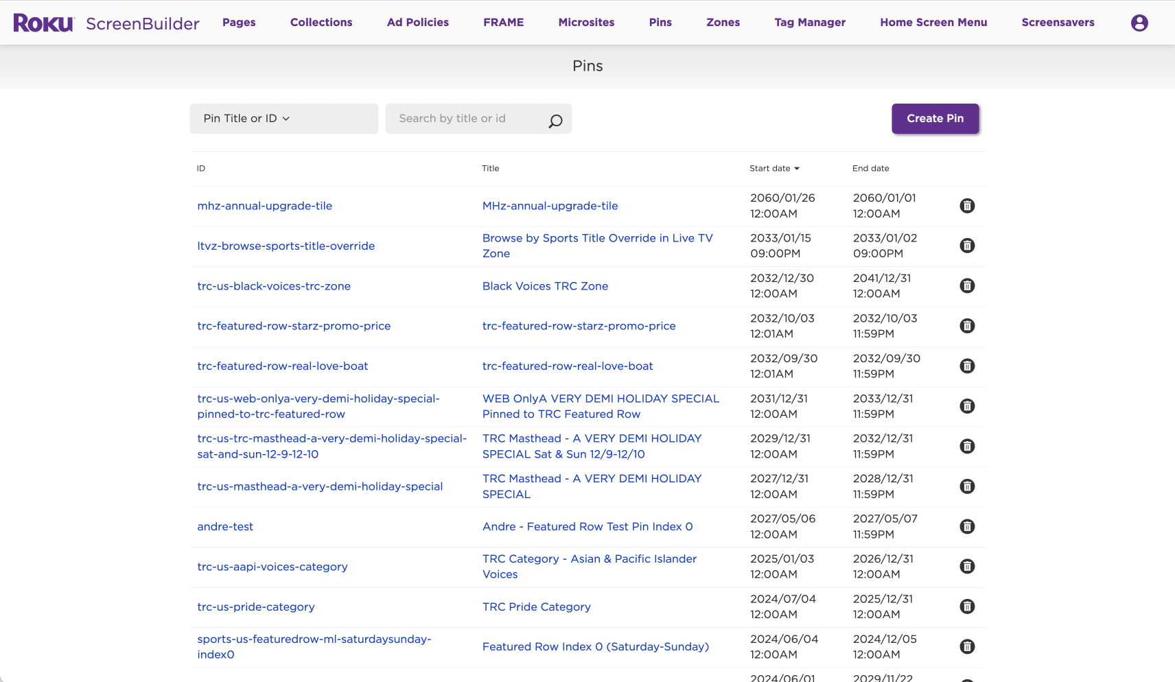
List display UI improvements:
Capability to mark a title as ‘Favorite’
Quick access to detailed information about a title without the need to open a separate window
Enhanced search functionality with advanced filtering options
User flexibility to customize the display by showing or hiding columns and saving personalized viewing preferences
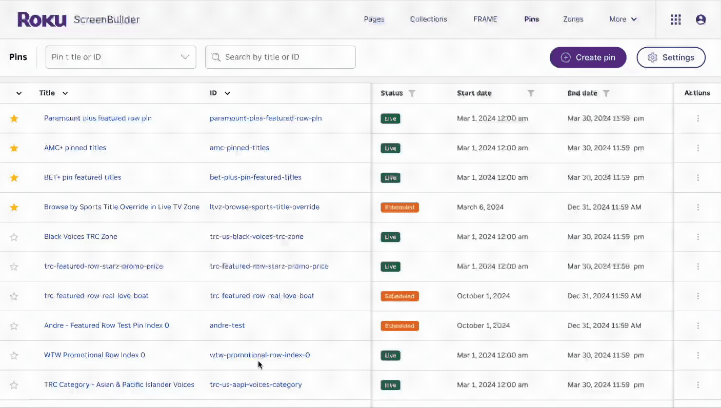
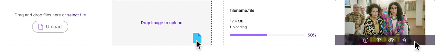
Photo uploader
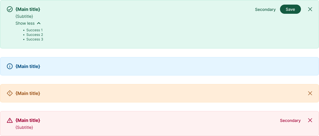
Banner alert (customizable)
Contributed to RDS by developing tool-specific components, aligning with RDS’s focus on consumer-facing apps
✨ Sprinkle in some joy ✨
Custom illustrations for empty states


“More user friendly!”
-Stephanie Cuevas
Manager, International Merchandising“[The redesign] solved some of the annoying problems we’ve been dealing with for years. Great solutions to some of our biggest editorial and merchandising challenges.”
-Mary Haynes
Sr. Manager, Live & Sports Merchandising
