ScreenBuilder Redesign
Designing a scalable creative platform for speed, autonomy, and global consistency
(View on desktop for best experience)
Company
Roku
Team
Designer (My role)
UI Engineers
Backend Engineers
Project Manager
Product Manager
Merchandising
Taxonomist
Copywriter
Users
Merchandising
Timeline
Aug 2022 - Dec 2025
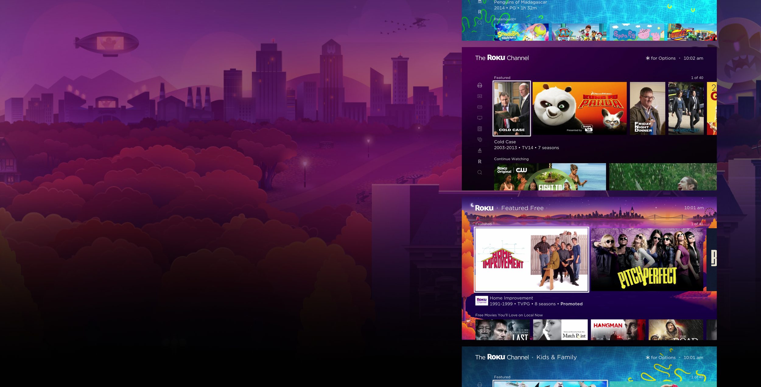
(Old ScreenBuilder)Overview
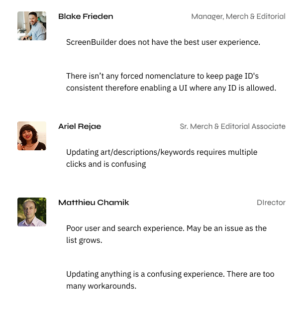
As usage scaled across teams, regions, and initiatives, the tool became a critical dependency, revealing a system that was brittle, engineering-dependent, and slow to evolve.
I led the redesign of ScreenBuilder into a flexible, system-level platform that enabled non-technical teams to independently create, update, and scale experiences while reducing engineering bottlenecks and improving consistency across global surfaces.

ScreenBuilder is not a single feature; it’s a core internal platform that powers how content experiences are created, updated, and maintained across Roku clients.
Problem Space
As ScreenBuilder grew, several systemic issues emerged:
Creative updates required engineering involvement, even for minor changes
Operators were forced through 15+ manual steps to complete common tasks
Teams tracked requests across spreadsheets, messages, and tools
Duplicate requests caused delays and occasionally cost the business money
The product felt stagnant, reducing confidence from internal stakeholders and ad partners
The constraints lived in ownership, dependencies, and workflow design—not in the interface itself.

Design Goal
Shift ScreenBuilder from a rigid internal tool into a flexible creative system that:
Enables speed without sacrificing governance
Reduces dependency on engineering
Scales across teams, regions, and future use cases
Feels intuitive for daily operators, not just power users
To guide system-level decisions, I aligned the team on a few core principles:
🧩 Design for autonomy
Operators should be able to build and iterate without engineering support.
🚧 Make constraints visible
Guardrails should guide users, not block them.
🧱 Favor systems over screens
Reusable patterns and workflows scale better than bespoke UI.
🧭 Optimize for real workflows
The system must reflect how teams actually work—not how we wish they did.

Research & Discovery
I worked closely with the Merchandising team in a controlled, low-pressured environment to map their end-to-end workflows. Key insights:
Most friction came from handoffs, not execution
Operators needed creative flexibility, but within defined rules
The system lacked a shared mental model across teams
Manual work increased error rates and slowed iteration
This discovery reframed the problem from “redesign the UI” to re-architecting the workflow model.
The Solution
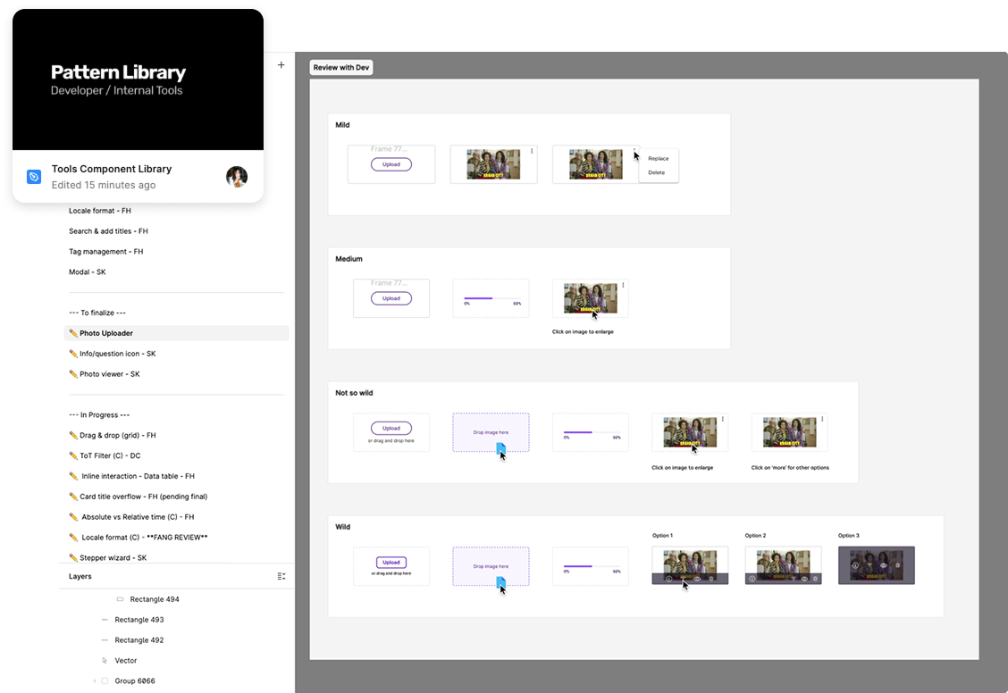
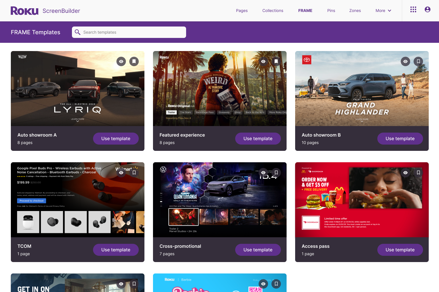
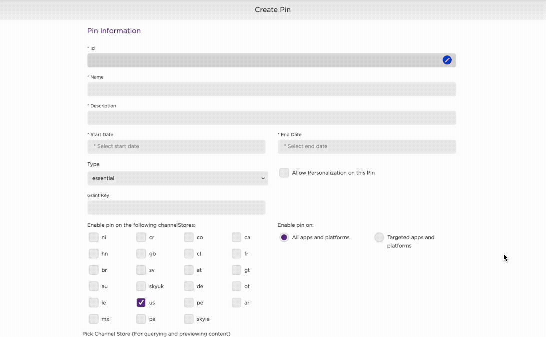
1. Modular, Template-Driven System
Instead of one-off builds, ScreenBuilder now supports:
Pre-defined templates
Flexible configurations
This allowed teams to create new experiences quickly while maintaining consistency.
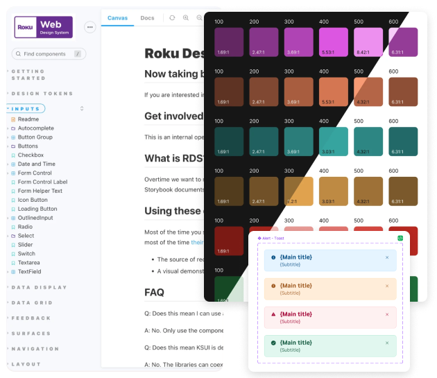
3. Design System Alignment
ScreenBuilder transitioned to the Roku Design System, allowing:
Faster development
Greater UI consistency
Easier scaling across surfaces and regions
This wasn’t just visual alignment — it was systemic alignment.
2. Reduced Engineering Dependency
By partnering closely with engineering, we evolved solutions into a reusable global components, enabling other teams to implement and extend functionality with minimal overhead.
Result:
Faster iteration cycles
Engineering time reserved for high-impact work
Creative teams gained ownership of their output
Impact
While quantitative metrics are pending, early outcomes showed:
Fewer manual steps required to complete common tasks
Reduced engineering involvement for routine updates
Improved confidence from internal teams and stakeholders
A platform positioned to scale with future creative needs.
“[The redesign] solved some of the annoying problems we’ve been dealing with for years. Great solutions to some of our biggest editorial and merchandising challenges.”
— Mary Haynes
Sr. Manager,
Live & Sports Merchandising


What Next?
Instrument the platform to measure time-to-publish and error rates
Design isn’t complete at launch — it matures through evidence-based iteration.
Expand template capabilities for new surfaces
Designing for future unknowns, not just current requirements.
Continue evolving governance models as usage scales
Governance isn’t about control — it’s about protecting quality while enabling speed. Great platforms balance freedom and responsibility as they grow.
Design highlights
Old navigation ⬇️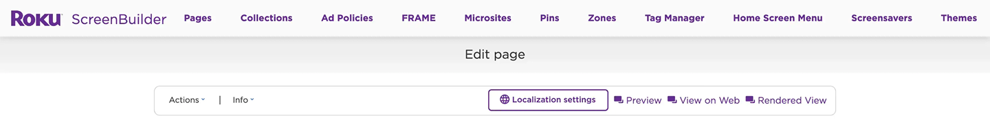
New navigation ⬇️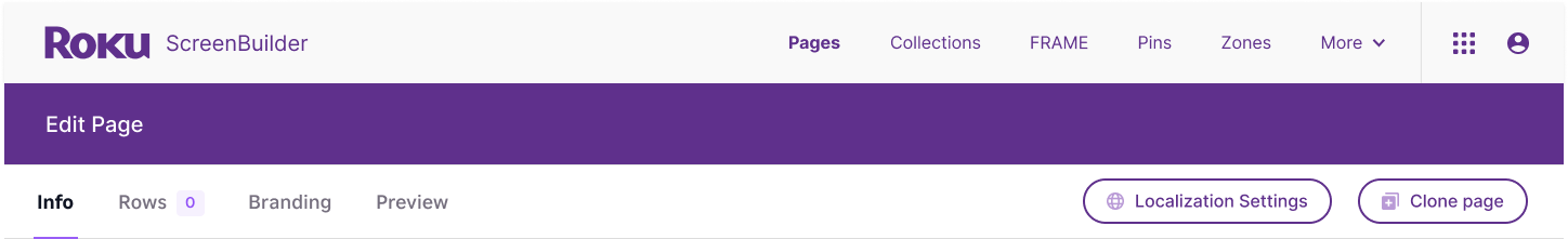
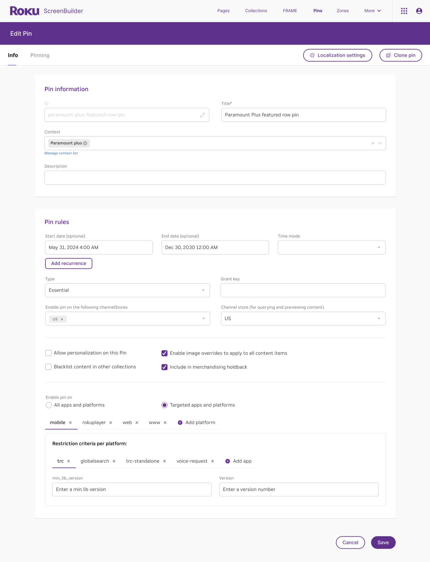
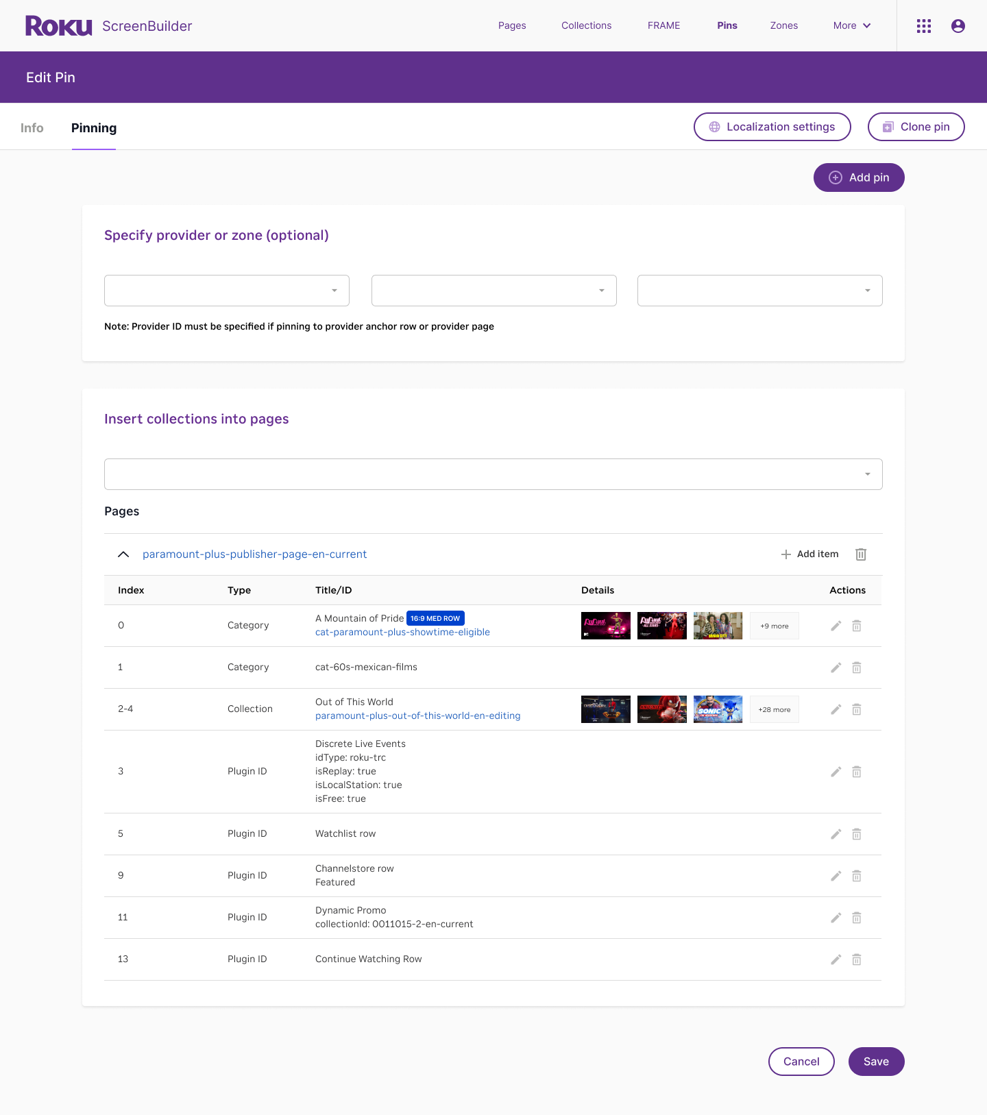
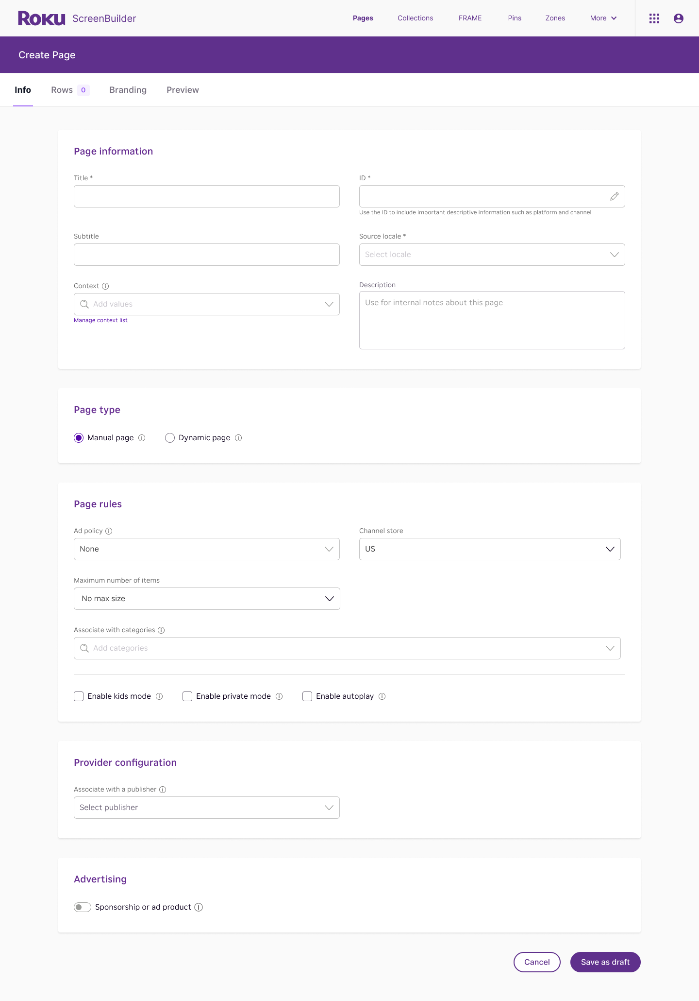
Layout and Structure
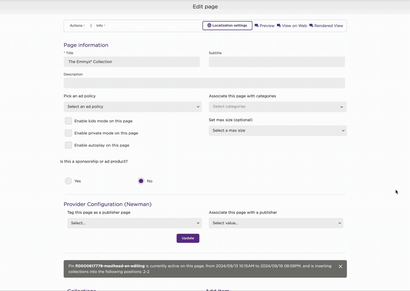
⬆️ Old: Everything is stacked on a single long page
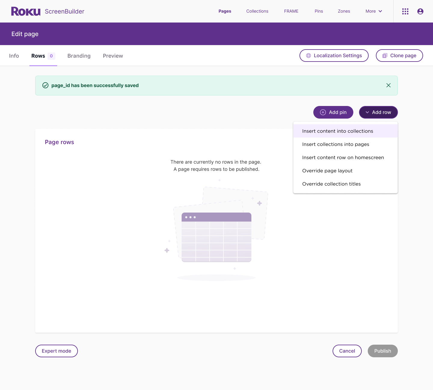
➡️ New: Content is broken into tabbed sections. Each step is separated into smaller, focused areas.
Improvement: Reduces cognitive overload by breaking tasks into manageable chunks.
Visual Design
⬆️ Old: Dense UI, minimal spacing, flat lists, and limited visual hierarchy
➡️ New: Spacious layout, clear card-like sections, and modern form design. Empty state illustrations to bring some joy.
Improvement: More approachable, modern, and consistent.
Content Items
⬆️ Old: Content embedded on the main page with long scroll lists, making it overwhelming when many items exist.
➡️ New: Grouped sections into their own tabs with clean controls.
Improvement: Cleaner workspace, easier to focus on structure first before loading content. Friendly empty state encourages next action.
Discoverability and Guidance
⬆️ Old: No clear workflow — everything is visible at once, users did not know where to start
➡️ New: Guided flow via tabs. Inline tooltips provide guidance without clutter.
Improvement: Onboards users more naturally, guiding them through steps rather than overwhelming them upfront.
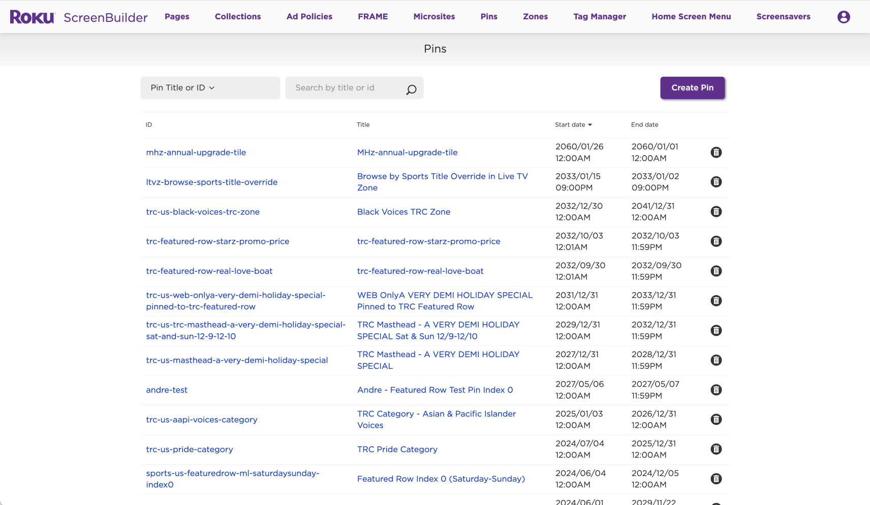
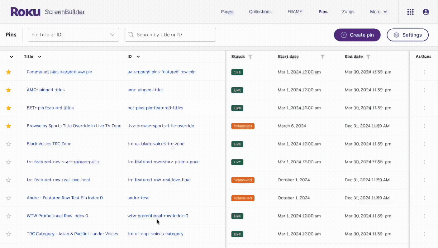
List display UI improvements:
Capability to mark a title as ‘Favorite’
Quick access to detailed information about a title without the need to open a separate window
Enhanced search functionality with advanced filtering options
User flexibility to customize the display by showing or hiding columns and saving personalized viewing preferences
sprinkle in some joy
*
sprinkle in some joy *
Custom illustrations by Soph Kim